1. Import Required Libraries
In [233]:
import sqlite3
import pandas as pd
import matplotlib.pyplot as plt
import seaborn as sns
import numpy as np
import warnings

warnings.filterwarnings('ignore')
sns.set_style('whitegrid')
plt.rcParams['figure.figsize'] = (12, 6)
2. Connect to SQLite Database
In [234]:
conn = sqlite3.connect('Company.db')
cursor = conn.cursor()
print("Successfully connected to Database")
Successfully connected to Database
3. Explore Database Schema
In [235]:
tables_query = """
SELECT name FROM sqlite_master
WHERE type='table'
ORDER BY name;
"""
tables_df = pd.read_sql_query(tables_query, conn)
print("Tables in database:")
print(tables_df)
Tables in database:
                 name
0            Customer
1          Department
2   DepartmentManager
3          Dependants
4            Employee
5           Inventory
6           Locations
7        OrderDetails
8              Orders
9             Product
10      ProjectMember
11           Projects
12          Warehouse
13             people
14    sqlite_sequence
4. Analysis 1: Top 10 Project Workers
In [236]:
project_workers_query = """
SELECT
    e.UserName AS Employee_Name,
    SUM(pm.Hours_Worked) AS Total_Hours_Worked
FROM
    ProjectMember pm
JOIN
    Employee e ON pm.Employee_ID = e.Employee_ID
GROUP BY
    e.UserName
ORDER BY
    Total_Hours_Worked DESC
LIMIT 10;
"""

workers_df = pd.read_sql_query(project_workers_query, conn)

plt.figure(figsize=(12, 6))
bars = plt.barh(workers_df['Employee_Name'], workers_df['Total_Hours_Worked'], color='coral')
plt.xlabel('Total Hours Worked')
plt.ylabel('Employee Name')
plt.title('Top 10 Project Workers by Total Hours')
plt.gca().invert_yaxis()

# Add data labels
for i, (bar, value) in enumerate(zip(bars, workers_df['Total_Hours_Worked'])):
    plt.text(value + 50, bar.get_y() + bar.get_height()/2, f'{int(value)}',
             va='center', fontsize=10, fontweight='bold')

plt.tight_layout()
plt.show()

5. Analysis 2: Department Manager Tenure
In [237]:
manager_tenure_query = """
SELECT
    e.UserName AS Manager_Name,
    d.Department_Name,
    CAST((julianday(COALESCE(dm.End_Date, date('now'))) - julianday(dm.Start_Date)) AS INTEGER) AS Days_as_Manager
FROM
    DepartmentManager dm
JOIN
    Employee e ON dm.Employee_ID = e.Employee_ID
JOIN
    Department d ON dm.Department_ID = d.Department_ID
ORDER BY
    Days_as_Manager DESC;
"""

managers_df = pd.read_sql_query(manager_tenure_query, conn)

plt.figure(figsize=(12, 6))
top_managers = managers_df.head(10)
bars = plt.bar(range(len(top_managers)), top_managers['Days_as_Manager'], color='darkgreen')
plt.xlabel('Manager')
plt.ylabel('Days as Manager')
plt.title('Top 10 Longest Serving Department Managers')
plt.xticks(range(len(top_managers)), top_managers['Manager_Name'], rotation=45, ha='right')

# Add data labels
for i, (bar, value) in enumerate(zip(bars, top_managers['Days_as_Manager'])):
    plt.text(bar.get_x() + bar.get_width()/2, bar.get_height() + 20, f'{int(value)}',
             ha='center', va='bottom', fontsize=10, fontweight='bold')

plt.tight_layout()
plt.show()

6. Analysis 3: Employee Count Over Time
In [238]:
employee_count_query = """
SELECT
    event_date,
    SUM(daily_net_change) OVER (ORDER BY event_date) AS employee_count
FROM (
    SELECT
        DATE(event_date) AS event_date,
        SUM(change) AS daily_net_change
    FROM (
        SELECT Start_Date AS event_date, 1 AS change FROM Employee
        UNION ALL
        SELECT Leaving_Date AS event_date, -1 AS change FROM Employee WHERE Leaving_Date IS NOT NULL
    ) all_events
    GROUP BY
        DATE(event_date)
) daily_changes
ORDER BY
    event_date;
"""

emp_count_df = pd.read_sql_query(employee_count_query, conn)
emp_count_df['event_date'] = pd.to_datetime(emp_count_df['event_date'])

plt.figure(figsize=(14, 6))
plt.plot(emp_count_df['event_date'], emp_count_df['employee_count'], linewidth=2, color='navy')
plt.fill_between(emp_count_df['event_date'], emp_count_df['employee_count'], alpha=0.3)
plt.xlabel('Date')
plt.ylabel('Employee Count')
plt.title('Employee Headcount Over Time')
plt.xticks(rotation=45)
plt.grid(True, alpha=0.3)
plt.tight_layout()
plt.show()

7. Analysis 4: Warehouse Inventory Value
In [239]:
warehouse_query = """
SELECT
    w.Address AS Warehouse_Address,
    SUM(i.Quantity * p.Price) AS Total_Inventory_Value
FROM
    Warehouse w
JOIN
    Inventory i ON w.Warehouse_ID = i.Warehouse_ID
JOIN
    Product p ON i.Product_ID = p.Product_ID
GROUP BY
    w.Address
ORDER BY
    Total_Inventory_Value DESC;
"""

warehouse_df = pd.read_sql_query(warehouse_query, conn)

plt.figure(figsize=(12, 6))
bars = plt.bar(warehouse_df['Warehouse_Address'], warehouse_df['Total_Inventory_Value'], color='purple')
plt.xlabel('Warehouse')
plt.ylabel('Total Inventory Value (£)')
plt.title('Warehouse Inventory Values')
plt.xticks(rotation=45, ha='right')
plt.ticklabel_format(style='plain', axis='y')

# Add data labels
for i, (bar, value) in enumerate(zip(bars, warehouse_df['Total_Inventory_Value'])):
    plt.text(bar.get_x() + bar.get_width()/2, bar.get_height() + 500, f'£{int(value):,}',
             ha='center', va='bottom', fontsize=9, fontweight='bold')

plt.tight_layout()
plt.show()

8. Analysis 5: Salary vs Tenure Analysis
In [240]:
salary_tenure_query = """
SELECT
    UserName AS Employee_Name,
    CAST((julianday(COALESCE(Leaving_Date, date('now'))) - julianday(Start_Date)) * 12 / 365 AS INTEGER) AS Months_Worked,
    Salary
FROM
    Employee;
"""

salary_df = pd.read_sql_query(salary_tenure_query, conn)
print("Salary vs Tenure Statistics:")
print(salary_df.describe())

plt.figure(figsize=(12, 6))
plt.scatter(salary_df['Months_Worked'], salary_df['Salary'], alpha=0.6, s=50, color='darkred')
plt.xlabel('Months Worked')
plt.ylabel('Salary (£)')
plt.title('Employee Salary vs Tenure')
plt.grid(True, alpha=0.3)

z = np.polyfit(salary_df['Months_Worked'], salary_df['Salary'], 1)
p = np.poly1d(z)
plt.plot(salary_df['Months_Worked'], p(salary_df['Months_Worked']), "r--", alpha=0.8, linewidth=2, label='Trend')
plt.legend()
plt.tight_layout()
plt.show()
Salary vs Tenure Statistics:
       Months_Worked        Salary
count     500.000000    500.000000
mean       36.840000  63429.194000
std        17.469768  21401.279064
min         3.000000  25000.000000
25%        22.750000  44384.500000
50%        36.000000  63761.000000
75%        50.000000  81669.750000
max        70.000000  99995.000000

9. Analysis 6: Product Inventory Distribution Heatmap
In [241]:
inventory_heatmap_query = """
SELECT
    p.Product_Name,
    w.Address AS Warehouse_Address,
    i.Quantity
FROM
    Product p
INNER JOIN
    Inventory i ON p.Product_ID = i.Product_ID
INNER JOIN
    Warehouse w ON i.Warehouse_ID = w.Warehouse_ID
ORDER BY
    p.Product_Name,
    w.Address;
"""

inventory_df = pd.read_sql_query(inventory_heatmap_query, conn)
inventory_pivot = inventory_df.pivot(index='Product_Name', columns='Warehouse_Address', values='Quantity')

plt.figure(figsize=(14, 8))
sns.heatmap(inventory_pivot, annot=True, fmt='g', cmap='YlOrRd', linewidths=0.5, cbar_kws={'label': 'Quantity'})
plt.title('Product Inventory Distribution Across Warehouses')
plt.xlabel('Warehouse')
plt.ylabel('Product')
plt.xticks(rotation=45, ha='right')
plt.tight_layout()
plt.show()

10. Analysis 7: Department Distribution
In [242]:
department_query = """
SELECT
    d.Department_Name,
    COUNT(e.Employee_ID) AS Employee_Count
FROM
    Department d
LEFT JOIN
    Employee e ON d.Department_ID = e.Department_ID
WHERE
    e.Leaving_Date IS NULL
GROUP BY
    d.Department_Name
ORDER BY
    Employee_Count DESC;
"""

dept_df = pd.read_sql_query(department_query, conn)

fig, (ax1, ax2) = plt.subplots(1, 2, figsize=(16, 6))

ax1.pie(dept_df['Employee_Count'], labels=dept_df['Department_Name'], autopct='%1.1f%%', startangle=90, colors=sns.color_palette('Set2'))
ax1.set_title('Employee Distribution by Department (Pie Chart)')

bars = ax2.bar(dept_df['Department_Name'], dept_df['Employee_Count'], color=sns.color_palette('Set2'))
ax2.set_xlabel('Department')
ax2.set_ylabel('Employee Count')
ax2.set_title('Employee Distribution by Department (Bar Chart)')
ax2.tick_params(axis='x', rotation=45)

# Add data labels
for bar in bars:
    height = bar.get_height()
    ax2.text(bar.get_x() + bar.get_width()/2, height + 2, f'{int(height)}',
             ha='center', va='bottom', fontsize=10, fontweight='bold')

plt.tight_layout()
plt.show()

11. Analysis 8: Department Salary Distribution (Violin Plot)
In [243]:
salary_dist_query = """
SELECT
    d.Department_Name,
    e.Salary
FROM
    Employee e
JOIN
    Department d ON e.Department_ID = d.Department_ID
WHERE
    e.Leaving_Date IS NULL;
"""

salary_dist_df = pd.read_sql_query(salary_dist_query, conn)

plt.figure(figsize=(14, 7))
sns.violinplot(data=salary_dist_df, x='Department_Name', y='Salary', palette='muted', inner='box')
plt.xlabel('Department', fontsize=12)
plt.ylabel('Salary (£)', fontsize=12)
plt.title('Salary Distribution by Department (Violin Plot)', fontsize=14, fontweight='bold')
plt.xticks(rotation=45, ha='right')
plt.grid(axis='y', alpha=0.3)
plt.tight_layout()
plt.show()

print("Salary Statistics by Department:")
print(salary_dist_df.groupby('Department_Name')['Salary'].describe())

Salary Statistics by Department:
                  count          mean           std      min       25%  \
Department_Name
Customer Service   82.0  60822.170732  23455.058137  25841.0  36799.50
Engineering        93.0  64921.204301  20713.750688  27519.0  46904.00
Finance            92.0  59923.250000  21687.780356  25833.0  40168.00
HR                 80.0  62275.787500  21160.592734  25839.0  47540.25
Sales              88.0  65379.579545  21038.877885  25000.0  50695.50

                      50%       75%      max
Department_Name
Customer Service  57442.5  82303.00  99993.0
Engineering       65446.0  81461.00  99995.0
Finance           59972.5  79137.25  99158.0
HR                62077.0  82296.50  99158.0
Sales             65871.5  79774.00  99991.0
12. Analysis 9: Location Employee Distribution (Treemap)
In [244]:
treemap_query = """
SELECT
    d.Department_Name,
    l.Address AS Location_Address,
    COUNT(e.Employee_ID) AS Employee_Count
FROM
    Department d
JOIN
    Locations l ON d.Department_ID = l.Department_ID
LEFT JOIN
    Employee e ON l.Location_ID = e.Location_ID
GROUP BY
    d.Department_Name, l.Address
HAVING Employee_Count > 0
ORDER BY
    d.Department_Name, Employee_Count DESC;
"""

treemap_df = pd.read_sql_query(treemap_query, conn)

# Create a simple treemap using squarify
import squarify

plt.figure(figsize=(16, 10))
colors = sns.color_palette('Set3', len(treemap_df))

squarify.plot(sizes=treemap_df['Employee_Count'],
              label=[f"{row['Department_Name']}\n{row['Location_Address']}\n({row['Employee_Count']} emp)"
                     for _, row in treemap_df.iterrows()],
              alpha=0.8,
              color=colors,
              text_kwargs={'fontsize':9, 'weight':'bold'})

plt.title('Employee Distribution Across Departments and Locations (Treemap)', fontsize=16, fontweight='bold', pad=20)
plt.axis('off')
plt.tight_layout()
plt.show()

13. Analysis 10: Product Order Volume Timeline (Area Chart)
In [245]:
product_timeline_query = """
SELECT
    DATE(o.Order_Date) AS Order_Date,
    p.Product_Name,
    SUM(od.Quantity) AS Total_Quantity
FROM
    Orders o
JOIN
    OrderDetails od ON o.Order_ID = od.Order_ID
JOIN
    Product p ON od.Product_ID = p.Product_ID
GROUP BY
    DATE(o.Order_Date), p.Product_Name
ORDER BY
    Order_Date, p.Product_Name;
"""

product_timeline_df = pd.read_sql_query(product_timeline_query, conn)
product_timeline_df['Order_Date'] = pd.to_datetime(product_timeline_df['Order_Date'])

# Pivot for stacked area chart
product_pivot = product_timeline_df.pivot_table(index='Order_Date', columns='Product_Name', values='Total_Quantity', fill_value=0)

plt.figure(figsize=(16, 8))
product_pivot.plot.area(stacked=True, alpha=0.7, figsize=(16, 8), colormap='tab10')
plt.xlabel('Order Date', fontsize=12)
plt.ylabel('Total Quantity Ordered', fontsize=12)
plt.title('Product Order Volume Over Time (Stacked Area Chart)', fontsize=14, fontweight='bold')
plt.legend(title='Product', bbox_to_anchor=(1.05, 1), loc='upper left')
plt.grid(True, alpha=0.3)
plt.tight_layout()
plt.show()
<Figure size 1600x800 with 0 Axes>

14. Analysis 11: Project Hours by Department (Radar Chart)
In [246]:
radar_query = """
SELECT
    d.Department_Name,
    SUM(pm.Hours_Worked) AS Total_Hours
FROM
    Department d
JOIN
    Employee e ON d.Department_ID = e.Department_ID
JOIN
    ProjectMember pm ON e.Employee_ID = pm.Employee_ID
GROUP BY
    d.Department_Name
ORDER BY
    d.Department_Name;
"""

radar_df = pd.read_sql_query(radar_query, conn)

# Create radar chart
categories = radar_df['Department_Name'].tolist()
values = radar_df['Total_Hours'].tolist()

# Close the plot by appending the first value at the end
values += values[:1]
angles = np.linspace(0, 2 * np.pi, len(categories), endpoint=False).tolist()
angles += angles[:1]

fig, ax = plt.subplots(figsize=(10, 10), subplot_kw=dict(projection='polar'))
ax.plot(angles, values, 'o-', linewidth=2, color='#1f77b4', label='Total Project Hours')
ax.fill(angles, values, alpha=0.25, color='#1f77b4')
ax.set_xticks(angles[:-1])
ax.set_xticklabels(categories, size=11)
ax.set_ylim(0, max(values) * 1.1)
ax.set_title('Total Project Hours by Department (Radar Chart)', size=14, fontweight='bold', pad=20)
ax.grid(True, linestyle='--', alpha=0.7)
ax.legend(loc='upper right', bbox_to_anchor=(1.3, 1.1))

# Add data labels
for angle, value, category in zip(angles[:-1], radar_df['Total_Hours'].tolist(), categories):
    ax.text(angle, value + max(values) * 0.05, f'{int(value)}',
            ha='center', va='center', fontsize=10, fontweight='bold')

plt.tight_layout()
plt.show()

15. Analysis 12: Department Manager Timeline (Gantt Chart)
In [ ]:
In [247]:
manager_timeline_query = """
SELECT
    d.Department_Name,
    e.UserName AS Manager_Name,
    dm.Start_Date,
    COALESCE(dm.End_Date, date('now')) AS End_Date,
    CASE WHEN dm.End_Date IS NULL THEN 'Current' ELSE 'Past' END AS Status
FROM
    DepartmentManager dm
JOIN
    Employee e ON dm.Employee_ID = e.Employee_ID
JOIN
    Department d ON dm.Department_ID = d.Department_ID
ORDER BY
    d.Department_Name, dm.Start_Date;
"""

timeline_df = pd.read_sql_query(manager_timeline_query, conn)
timeline_df['Start_Date'] = pd.to_datetime(timeline_df['Start_Date'])
timeline_df['End_Date'] = pd.to_datetime(timeline_df['End_Date'])

# Create Gantt chart using matplotlib
fig, ax = plt.subplots(figsize=(16, 10))

# Get unique departments and assign y-positions
departments = timeline_df['Department_Name'].unique()
dept_positions = {dept: i for i, dept in enumerate(departments)}

# Color map for current vs past managers
colors = {'Current': '#2ecc71', 'Past': '#3498db'}

# Plot horizontal bars for each manager period
for idx, row in timeline_df.iterrows():
    dept_pos = dept_positions[row['Department_Name']]
    start = row['Start_Date']
    end = row['End_Date']
    duration = (end - start).days

    # Create bar
    bar = ax.barh(dept_pos, duration, left=start, height=0.6,
                   color=colors[row['Status']], alpha=0.8, edgecolor='black', linewidth=1)

    # Add manager name label in the middle of the bar
    mid_date = start + pd.Timedelta(days=duration/2)
    ax.text(mid_date, dept_pos, row['Manager_Name'],
            ha='center', va='center', fontsize=9, fontweight='bold', color='white')

# Formatting
ax.set_yticks(range(len(departments)))
ax.set_yticklabels(departments)
ax.set_xlabel('Date', fontsize=12)
ax.set_ylabel('Department', fontsize=12)
ax.set_title('Department Manager Timeline Over Time', fontsize=14, fontweight='bold')
ax.grid(True, axis='x', alpha=0.3, linestyle='--')

# Add legend
from matplotlib.patches import Patch
legend_elements = [Patch(facecolor=colors['Current'], label='Current Manager'),
                   Patch(facecolor=colors['Past'], label='Past Manager')]
ax.legend(handles=legend_elements, loc='upper right')

# Format x-axis dates
fig.autofmt_xdate()
plt.tight_layout()
plt.show()

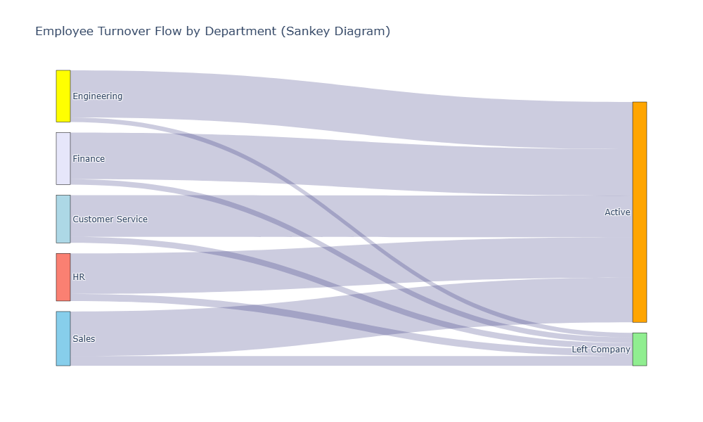
16. Analysis 13: Employee Turnover Analysis (Sankey Diagram)
In [248]:
turnover_query = """
SELECT
    d.Department_Name,
    CASE
        WHEN e.Leaving_Date IS NULL THEN 'Active'
        ELSE 'Left Company'
    END AS Status,
    COUNT(*) AS Employee_Count
FROM
    Employee e
JOIN
    Department d ON e.Department_ID = d.Department_ID
GROUP BY
    d.Department_Name, Status
ORDER BY
    d.Department_Name, Status;
"""

turnover_df = pd.read_sql_query(turnover_query, conn)

# Prepare data for Sankey
import plotly.graph_objects as go

departments = turnover_df['Department_Name'].unique().tolist()
statuses = ['Active', 'Left Company']

# Create node labels
labels = departments + statuses

# Create links
source = []
target = []
value = []

for _, row in turnover_df.iterrows():
    dept_idx = labels.index(row['Department_Name'])
    status_idx = labels.index(row['Status'])
    source.append(dept_idx)
    target.append(status_idx)
    value.append(row['Employee_Count'])

# Create Sankey diagram
fig = go.Figure(data=[go.Sankey(
    node=dict(
        pad=15,
        thickness=20,
        line=dict(color='black', width=0.5),
        label=labels,
        color=['lightblue', 'yellow', 'lavender', 'salmon', 'skyblue', 'orange', 'lightgreen']
    ),
    link=dict(
        source=source,
        target=target,
        value=value,
        color='rgba(0,0,96,0.2)'
    )
)])

fig.update_layout(
    title_text='Employee Turnover Flow by Department (Sankey Diagram)',
    font_size=12,
    height=600,
    width=1000
)

fig.show()
17. Close Database Connection
In [249]:
cursor.close()
conn.close()
print("Database connection closed successfully")
Database connection closed successfully